Farmacia Ercon
The Quest
Ever since the beginning of the pharmaceuticals business Ercon has focused on a new type of patient service, based on affordable prices, a wide range of products and specialized professional advice. Ercon Pharmacy has recently oriented towards new business directions: online sales and specialization on baby care products (diapers, powdered milk) at very advantageous prices.
The pharmaceutical market in Constanta is characterized by a strong competition, with a large number of pharmacies located in all neighbourhoods, sometimes more pharmacies next to each other.
In this context, Ercon’s strategy is to create a relevant and unitary image in the, with the goal of creating brand awareness and trust.
Brand Promise & Positioning
Farmacia Ercon brand identity was developed to support the company’s vision and values, promoting an efficient, safe and responsible use of medicines, combining the professional skills with the care and empathy towards the patient.
Farmacia Ercon’s vision is to serve the community through professional recommendations and an effective and friendly communication. A sincere smile is the first thing that we offer to our customers.
The brand promise is also supported by the slogan, which reinforces the friendly spirit of the logo, bringing the smile to the forefront and to a declarative level.
The Approach
The overall objective of the project was to build a branding strategy to differentiate the company in online and retail pharma sales and develop a full brand identity
The approach was based on understanding the context of the market and identify positioning opportunities in order to shape a creative brand strategy and build a new and fresh image for the brand.
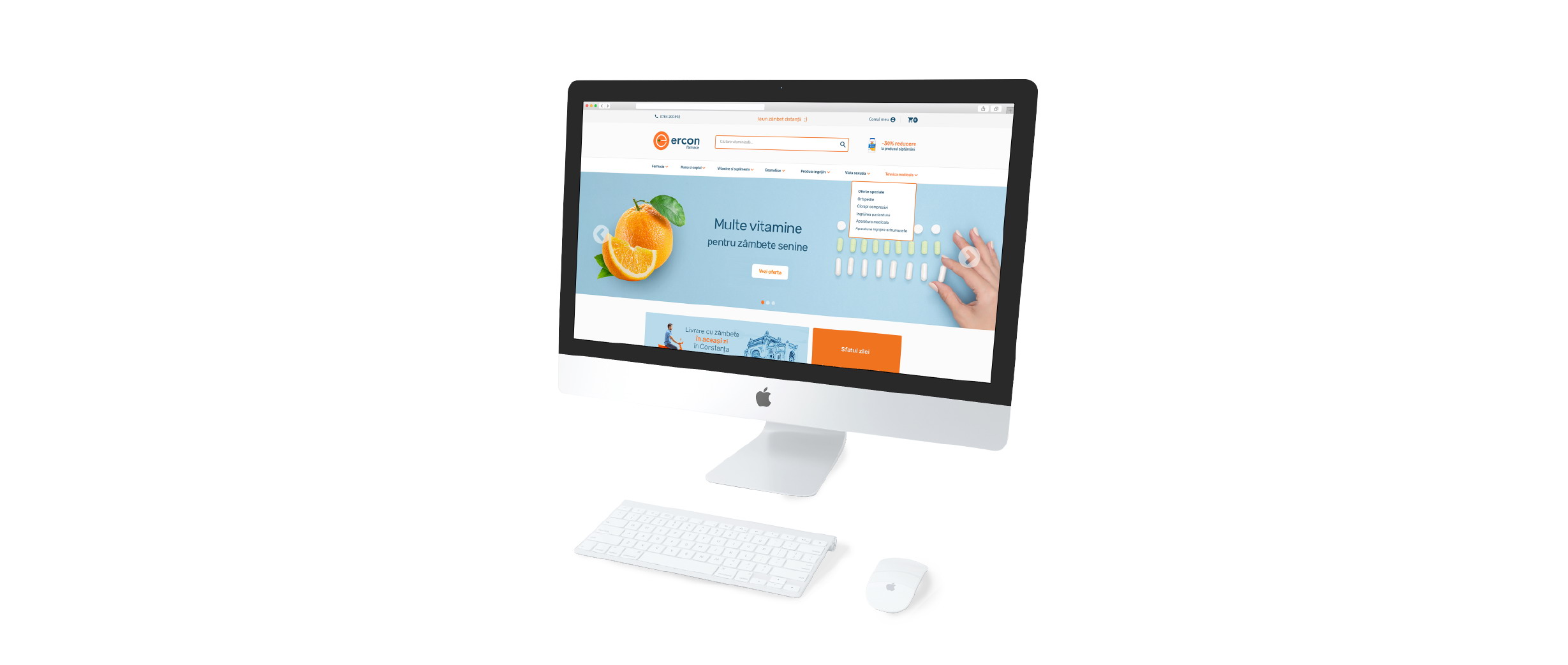
The Solution: Farmacia Ercon | La un zâmbet distanță
The developed solution reflects the new positioning strategy: a refreshing approach to well being, by combining competent recommendations with a friendly communication and proactive tips.
The proposed symbol constitutes a representation of the letter ‘e’ in an eloquent form for the idea of health – an orange (vitamin C, energy, vitality, prevention). The leaves of the orange, stylized in the plus form, position the brand in the field, but in a more natural and friendly way, emphasizing a friendly interaction.
The color palette was chosen to reflect the freshness and openness of the brand and the use of a simple and clear font supports furthermore a new way of communication with the clients, more transparent and empathetic.
Branding


Website